


The Apple TV + user experience has been improved for all users who want to access it through the browser. The home screen has been completely renovated, obtaining a design that reproduces the one currently used in the television application.
Apple TV + is normally used from the browser by users whose TV is not compatible with the official application or those who don’t have Apple devices such as Windows or Android devices. Additionally, Mac users who cannot update to Catalina and therefore also do not have the native app on, will also notice this change if they access from the browser.
The service through the browser has always had a very basic user interface and does not stand out for being the broadest in terms of functionality.. When the service was launched in November 2019, the web application used a scrolling something primitive to show off all the content it had. Which, on the other hand, was quite rare at the time. This gave users the feeling that the service, while seeking to mirror the image, was not at all forward thinking.
Design continued in this manner until this week, although Apple has been increasing the content since then. This generated a list that lacked meaning when it came to finding the content you wanted
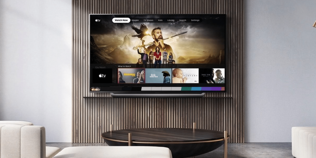
With the new user interface update, Apple TV + gets a more modern design, where we can find content by genre, the latest versions or continue what we were seeing in a much easier and more familiar way.
This is a giant step in the right direction of the service. Competing with other monsters like Netflix, where content is so easy to find and you discover news almost every moment, Apple TV + must engage the user, and their experience with the app is arguably the most important point of contact between the service and the user.